Showing posts with label General. Show all posts

Wednesday, December 14, 2011

Sofa So Good: Finale

Our sofa from Sanctuary dian arrived several days ago but we did not unwrap it until the crib was cleaned. Yesterday, we peeled off the plastic wrap and were delighted by the results.

The sofa inspired by Patricia Urquiola's Field design sits well with the colors of the dining set. It also blends nicely with the wood flooring and brick wall to effect the cosmopolitan loft effect that we envisaged.

With this last furniture in, we have gladly arrived at the conclusion of this renovation project. Time to heave a sigh of relief and then move on to the next stage - house moving.

Tuesday, November 22, 2011

The Dining Room Photo Project

Dear friends, we need your help in picking out the best photo for our dining room.

After successfully finding our kitchen photo (link), we are now working with YC of TwentyOne-Fifty Photography to pick a photograph for the dining room. The following cropped photographs were shot by YC during his Chicago trip. Please let us have your views on which is the most appropriate photo for our dining room.

(A) Silhouette Skyline


(B) Windy City


(C) Up In The Sky


Using simple tweaks on Photoshop, here's how each photo might look on the actual wall:

(A)
 (B)
 (C)

Looking forward to your vote and opinions. =)

Thursday, November 17, 2011

The Kitchen Photo Project


We are looking for a picture for our kitchen. The main idea is to add a dash of red color to the kitchen for better feng shui. And also as kitchen deco, close-up photograph of some red vegetables or fruits would be an ideal subject for the picture. It's more personal if the photograph was self shot.


We were privileged to have a lot of help from YC from TwentyOne-Fifty Photography (see their wedding photography portfolio here / YC's personal portfolio here). He came over to the apartment on a Sunday and we attempted to shoot macro-photography of some strawberries and bell peppers.


YC contributed a lot in the lighting department. Without his light/soft box and his guidance with light play, the photos wouldn't have come out nice. Although I was doing most of the shooting, my 50mm prime lens proved to be inadequate for macro photography. The focal length was insufficient. Even with YC's macro extension attached to my lens, it was still hard to focus perfectly. Hence the session was a bit harder and time consuming because of the inadequacy in the lens department.


Strawberries were a lot of fun to shoot. Their rich vibrant color and textured skin provided a lot of details in the photographs. The outcome looked impressive, I couldn't believe that it was shot right on my kitchen cabinet top. We also made an attempt with some bell peppers.


Bell peppers were tricky. Despite having a rich color and nice shape, we could not capture the right feel. We even attempt using a different background, like shooting on a piece of my floor laminate. The wood texture looks nice so we tried shooting other subjects on it.


Out of the many shots taken, those that made the shortlist had to fulfill our criteria and have the right feel for our kitchen wall. After rounds of review and post-processing, we found our winning shot...

Tuesday, November 15, 2011

The Not So WonderWall...


Today was spent at the apartment resolving issues. Removing the groove tapes to reveal the brick wall took half a day. From a distance, the brick wall effect actually looks pretty good.


Unfortunately at close inspection, the workmanship was really unacceptable. The crooked groove lines and uneven brick design looks apparent. So the contractor agreed to redo the wall and use another application method to ensure a better execution next time. First of all, they need to remove everything that was previously done and restore the wall to original state. 


By late evening, the wall was completely void. When the "bricks" were scrapped off, they came out taking the undercoat, emulsion and primer paint. Even the ultra hard compound plaster came off at some areas revealing the paint done by the previous owner! The sight of it was funny and pathetic at the same time.

While it seems that we are back to square one for this wall. Let's choose to believe that it's the beginning of better things to come! Well that is, in 2 weeks to come... =)   

Monday, November 14, 2011

Major Hiccup! Delays Expected Again...

I lament on the fact that our renovation progress has been hit by another delay! What a bummer...

This time, it's the nightmare that every new homeowner dreads, getting nearly irreversible results that was not what was promised. As I blogged in the previous entry, the brick feature wall was undergoing preparatory work. After 3 days of work, we are most displeased with the results when we inspected the progress today!


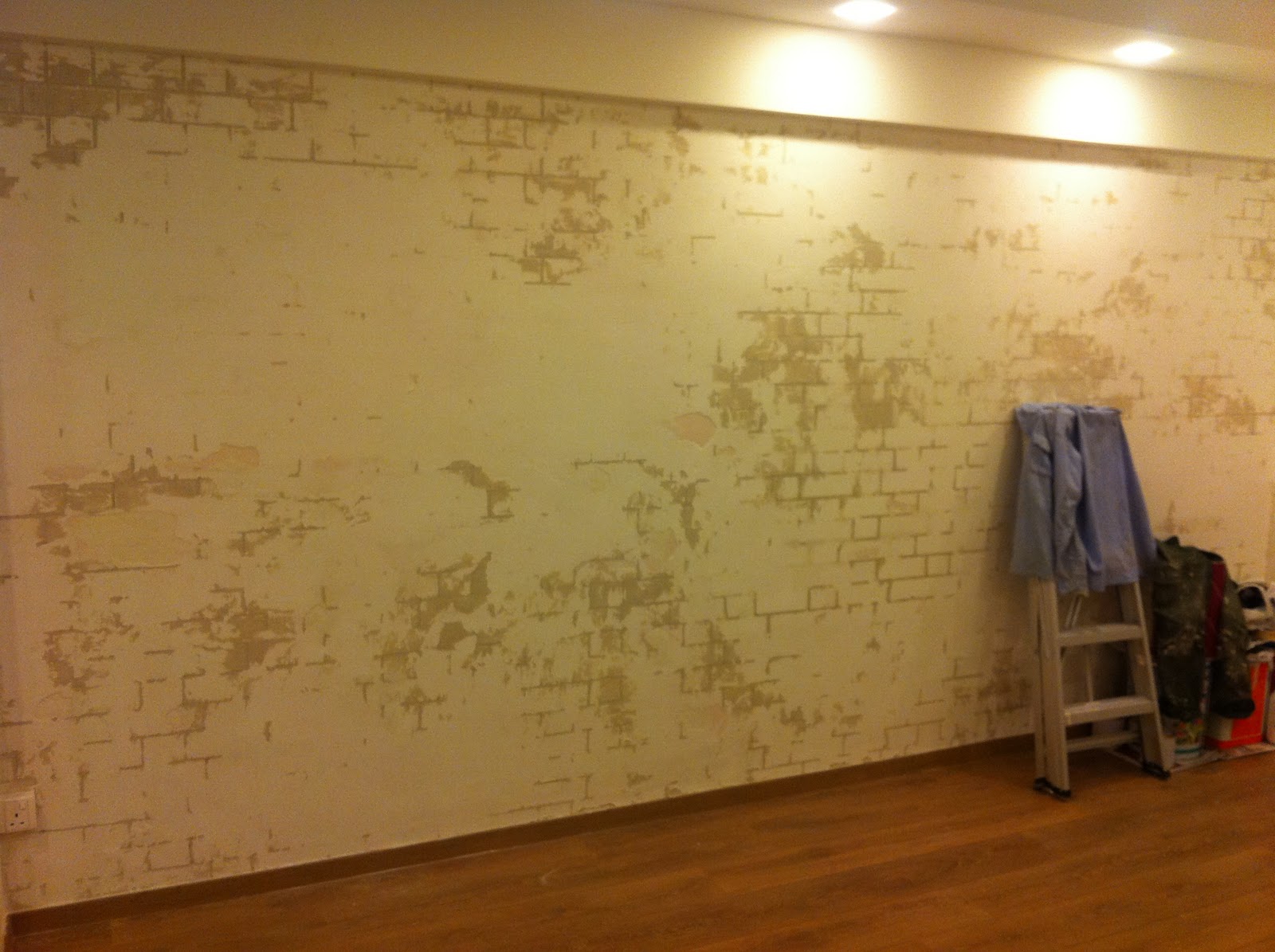
The photo above shows the partial completed brick wall. The textured paint has been sprayed on and is drying. Where the groove lines were exposed, the problem areas become evident. The groove lines are slanted (notice those in the lower row?).

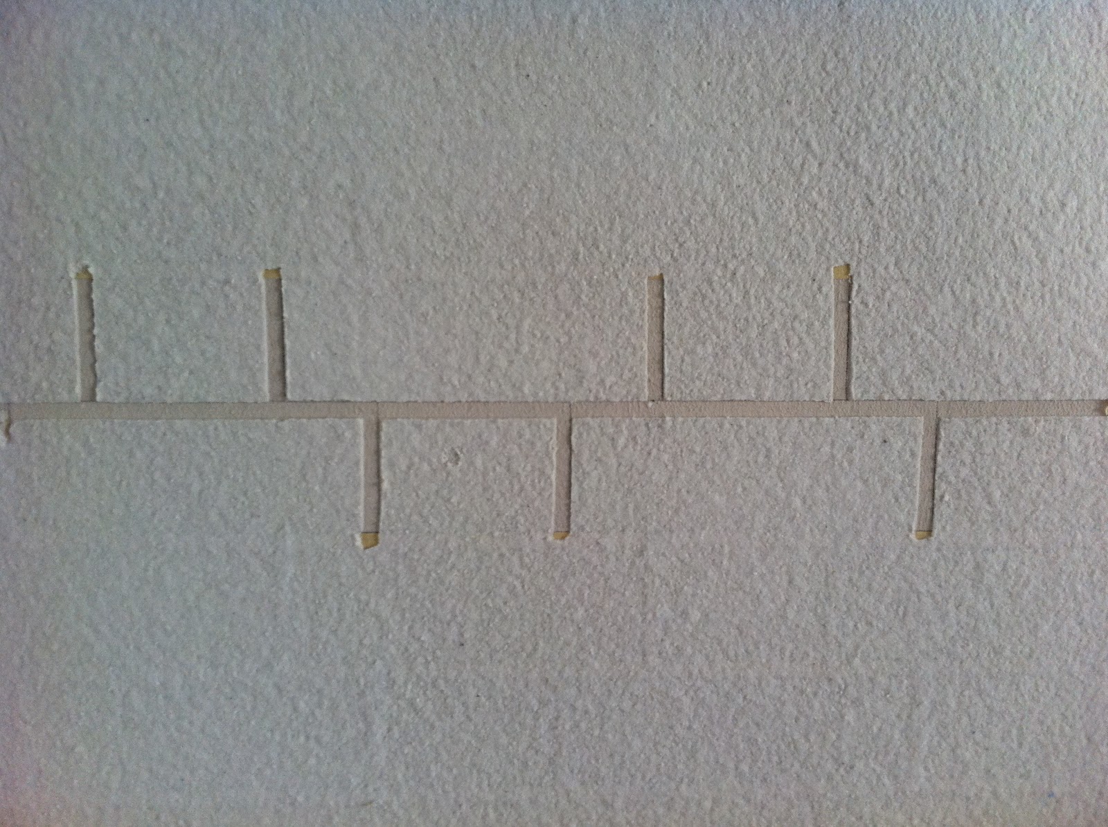
The following photo shows the preparatory work being done on the wall. The brick lines were all manually drawn. Subsequently, the lines were masked by masking tape. After the application and drying of the textured paint, the masking tape will be peeled off, exposing the groove lines to complete the brick wall effect.


The issue is that the process was entirely manual and susceptible to human error. There's no way to ensure that the masking tape form perfect straight lines and this resulted in a lot slanted groove lines. We were always ready to accept a margin of error but the results were beyond our threshold of tolerance.


The bigger issue is that we are not getting what we are prepared to pay for. According to the supplier's catalog, the process involved the use of a "Template" to ensure standardized brick design (See above pic). So why was masking tape used in our case which resulted in poor outcomes of wasted time, material and effort, gaining dissatisfied customer, and tarnishing the brand name of a reputable Japanese company? 

We are expecting the supplier to make good on what they have promised after a meeting with their sales representative today. As the brick wall starts drying, the paint becomes as hard as rock making a reverse process almost impossible. Our request to the supplier is to revert the wall to original condition by removing what has been done ASAP and then start over using a template and a more skilled applicator to finish the job. It's arduous and time consuming but it beats having to hack and re-plaster the entire wall before starting over, which will result in even more wasted time and effort. Then we may even have to remove and reinstall our timber skirting. (Nooooooooo....!)

It looks like this setback is going to delay us by weeks perhaps. =(

Saturday, November 12, 2011

The Beginning Of the End


3 weeks elapsed without much activity as Jeremy, our ID was out stationed for another project assignment. Yesterday, the contractor for our brick wall finally send a guy yesterday to begin preparatory work. At last, the final phase of renovation is going to take place.

Thinking back, renovation has been in progress for three months already. The first day of hacking was August 10 and yesterday was 11th November. We have requested to Jeremy, our ID for the entire process to be completed within another week. This entails not only the brick feature wall construction but also adding the finishing touches to the entire apartment's renovation. On our part, we'll be coordinating the delivery of furniture and installation of blinds. Looks like we got quite a busy week ahead of us.

Friday, November 4, 2011

Thursday, September 29, 2011

Newly Bought

Here's a little update on our recent purchases.

- Bedside Table -
Our slow search has definitely paid off as we finally found the perfect bedside table at Lifestorey. Not only is it compact enough to fit into the tight space we have in our master bedroom, it meets our functional needs and best of all aesthetic desires.

Componibili by Kartell
3 modular elements round tower in white to match our 22" high king size bed.


- Coffee Table -
Our main criteria for the coffee table was that it should give the living room an open airy feel. And we figured the best way to achieve that was to get a clear coffee table that is streamline & functional. And we found just the right piece at Comfort Design.

Clear Coffee Table
(Inspired by Umbra's Magino Coffee Table)

A strikingly simple and functional piece with integrated magazine rack made of clear acrylic.


- Red Sculpture -
We chanced upon this art gallery while we were shopping for sanitary hardware along Jalan Besar. A red sculpture that was placed at the entrance of the gallery caught our eye and we walked in and the rest was history. I thought the sculpture looked like a coral, our ID thought it looked like a leaf, and my Mum thought it looked like a cactus. What do you make out of it? :)

Red Sculpture
To add a hint of colour in our otherwise neutral living hall.


- Hood . Hob . Oven -
Our requirements for hood and hob were:
a) both hood and hob should be streamline
b) stainless steel hob for safety reasons cos the oven will be placed below
c) ease to clean
d) cast iron supports
We had initially wanted to get domino hobs from Electrolux. But eventually changed our minds cos Electrolux domino hobs don't come with cast iron supports.

Tecno Slim Line Hood (Square).TH968T


Tecno Built-in Hob.TA863TR


Bosch Built-in Oven.HBN331E2J

Wednesday, September 14, 2011

A Simple Plan

Spatial planning for our crib turned out to be more difficult than we expected. It was the first hurdle of beginning renovation.

It is an art that requires careful balancing of functionality, aesthetics, budget and practicality. Working within the limited space of 721 square feet and structural constraints of beams and pipes, we sought to revamp the layout of our apartment into living spaces that are functional and modern.

For instance, our idea of a modern functional master-bathroom should at least house a bidet, wash basin and a shower cubicle to provide convenience and privacy. Our main headache here was the space constraint. It took some imagination, gut feeling and heavy duty spatial planning to achieve what we want.

The extent of spatial planning was also something that we had to grapple with. In the early stages, several interior designers we spoke to proposed major spatial rearrangement which entailed, hacking down entire rooms and recreating them in other parts of the apartment. The proposed ideas were fresh and unique but feels not quite adequately practical nor budget friendly. Sometimes we got the feeling that the IDs were trying to get their designs into the next issue of "Home and Decor" at our expenses.

Finally, we arrived to a conclusion based on what we need. We need to retain the structure of the original layout as much as possible. There is a possibility of renting out the place after the 5 years Minimum Occupation Period as stipulated by the HDB. A two bedroom apartment is easier to rent out that a one bedroom.

So instead of totally revamping the layout, we applied minimum creativity touches, specifically in the kitchen, master-bedroom and master-bathroom, to bring in a balance of aesthetics and practicality. Focus was more on renovating the basic fundamentals of electrical wiring, pipes, tiles and windows for a modern and practical feel. For instance, unsightly pipes were made invisible by covering them up.

And that, ladies and gentlemen, was our simple plan. =)

Living and Dining: No major revamp. Dining area was enlarged by pushing back the kitchen divider.


Kitchen: Kitchen can be sealed by sliding door. Food preparation counter is beside fridge. Cooking hob is opposite counter, washing area is beside the stove for convenience as it is usually the last step of the process. A tall cabinet is to be erected beside the washing area to cater for storage needs.


Office: Currently blank. A built-in cabinet will be erected beside the entrance for storage needs.


Master-bedroom: Storeroom is collapsed to make way for walk-in wardrobe. Wardrobe will extend into the bedroom. Master-bathroom will also extend into the bedroom to provide more space for what we need. We reckon that bedroom is for rest so only minimum space is required. Any additional space has been utilized for more useful purposes.

Monday, September 12, 2011

Work In Progress!

As renovation progresses, our apartment is fast metamorphosing from a dingy old flat to a brand new apartment with modern finishes. The new windows did a great job with natural lighting and ventilation control. Plastering the walls helped to alleviate wall and ceiling imperfections. New tiles made the floor looks up to date.

At present, the apartment still looks drab and grey but it's nothing that a fresh coat of paint and electrical lighting cannot fix.

Work in progress: the tiler and contractor's work stuff are still strewn all over the place. Walls and ceiling had been made smooth via plastering of ultra hard compound

The dividing wall between the living room and the kitchen had been pushed back to make both places more optimally functional. The stiffener (protruding beam across the living room ceiling) marks where the divider wall used to be and it will be covered up by the false ceiling. 

The new windows serves to throw more light into the kitchen and make the space appear bigger and they also better ventilate the apartment.

The apartment really looks "industrial" with grey tiles and grey walls. Me like ;)

No more dingy kitchen toilet!

The future office. Nothing much done except wall/ceiling plastering and installation of new windows.

The master-bedroom work in progress, the master bathroom had been extended out.


The future walk-in-wardrobe

We had lots of showflat inspiration and a contractor who's a "toilet specialist", the toilet better turn out good! =P