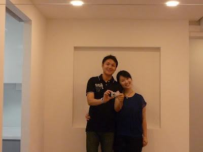
Our renovation is almost complete save for some minor area touch up.
Kitchen
The kitchen is our favorite. It turned out more spacious than we expected after the installation of cabinetry on both sides. The estimated width of the walkway is about 1.5 m and that is plenty of space. I think kitchen space like this is really rare in the public and private property market nowadays as space becomes a scarcity (probably with the exception of landed homes).
The top hung cabinets are laminated in gloss white for a clean look. The lower hung cabinets are topped with white solid surface top with matching white powder coated glass back-splash and metallic grey laminates. The look we are going for is clean, posh but durable and low maintenance.
Living and Dining Room
The living room is almost ready pending the brick wall. We love to have the brick wall but we are experiencing some hiccups in getting it. Instead of boring you with the full details, let's just say, it'll be delayed. Otherwise, the living room is ready to receive furniture.
Mirrors are nice. It makes the small dining room look bigger and brighter than it is.
Office/Study (Cabinet)
I love the effect where the wooden flooring runs directly into the wardrobe. When I first saw this kind of effect in Flamingo Valley show flat and I told myself I want this effect for my wardrobe. The small hole on the left side of the cabinet is for my small fish tank. =)
Bathrooms


Hi Sencha,
ReplyDeletehappen to stumble across your blog. I really like your shower screen with its metal kerb at the base instead of common concrete kerb. May I ask where you bought the shower screen? Thanks for sharing!
Hi Jason, thanks for stumbling by. I got it from Aust Screen.
ReplyDeleteWasn't optimistic that I would get a reply, Thanks Sencha! :)
ReplyDelete