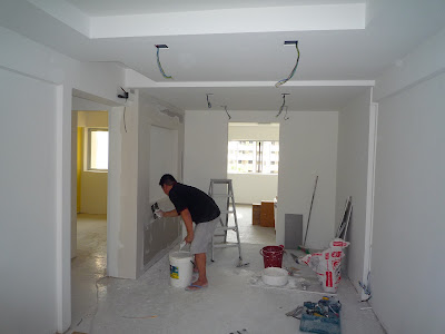
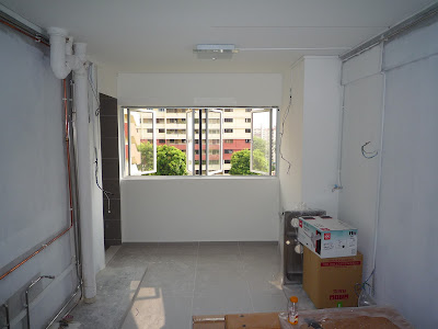
Our renovation is almost complete save for some minor area touch up.
Kitchen
The kitchen is our favorite. It turned out more spacious than we expected after the installation of cabinetry on both sides. The estimated width of the walkway is about 1.5 m and that is plenty of space. I think kitchen space like this is really rare in the public and private property market nowadays as space becomes a scarcity (probably with the exception of landed homes).
The top hung cabinets are laminated in gloss white for a clean look. The lower hung cabinets are topped with white solid surface top with matching white powder coated glass back-splash and metallic grey laminates. The look we are going for is clean, posh but durable and low maintenance.
Living and Dining Room
The living room is almost ready pending the brick wall. We love to have the brick wall but we are experiencing some hiccups in getting it. Instead of boring you with the full details, let's just say, it'll be delayed. Otherwise, the living room is ready to receive furniture.
Mirrors are nice. It makes the small dining room look bigger and brighter than it is.
Office/Study (Cabinet)
I love the effect where the wooden flooring runs directly into the wardrobe. When I first saw this kind of effect in Flamingo Valley show flat and I told myself I want this effect for my wardrobe. The small hole on the left side of the cabinet is for my small fish tank. =)
Bathrooms
Friday, October 21, 2011
Walk-In-Wardrobe
The walk-in-wardrobe area sits on the original storeroom plus a 1 foot encroachment into the master bedroom. The result is a 1.8m x 1.8m space. Using pole system instead of the wardrobe carcass creates more walk-in space.
The wardrobe sliding glass doors were selected to match the bathroom door. The 1.9m tall glass doors creates the perception of a taller ceiling than it is.
On another note, our yellow wall, painted with Nippon Paint's unique "Miner's Gold" blend, looks pretty strong and vibrant and is casting a yellow tint in the photo.
Wednesday, October 12, 2011
The Brick Wall Effect
The exposed brick wall is one of our favorite interior design looks. Coupled it with raw look of wooden floor finishes, we get a hint of the loft lifestyle that inspire us.
The brick wall is one of the major item in our renovation process. It is going to cost us and also set back our completion date by a week but we are not going to care. Once the brick wall is completed, it will become the decorative feature wall behind the sofa in the living room.
Actually, this is the 9th week into our renovation (Please refer to this post for part of reason for the delay). Usually, a renovation project of our apartment's scale takes about 6~8 weeks. So we are really behind time. And the open house will have to wait. =P
The choices for creating the brick wall vary :
(1) Apply wall paper with brick wall motif
(2) Build an actual brick wall
(3) Lay brick tiles on the wall
(4) Spray paint a brick wall
Option (1) is ugly. The "brick" wall has a fake look and even worse without the texture. Bleah....!
Option (2) is too expensive and HDB will never approve it because of laden weight issue.
Option (3) is the most popular method. Do a search on Renotalk & Myhometown dot sg and you will come across many homeowners choosing this solution.
And so you can guess now what we are going to choose?
.
.
.
.
It's Option (4)! Surprise, surprise! Yes, we are going experimental with spray painting the brick wall! In fact, the top picture features a spray painted brick wall that comes with real groove lines and texture! So we decided on the following:
We are engaging a specialist company in architectural coating and paint to help us. The company is going to show us a sample of our selected design by next week. I'll post an update then. In a nutshell, we learnt that the process of creating the spray painted brick wall is as follows:
1) Application of base coat
2) Set the template
3) Spray in the brick materials
4) Remove template
5) Application of top coat
6) 出きった! \(^o^)/
On the right shows the groove colors that we can select. The grab below is the template that we have selected.
We are looking forward to seeing a completed sample next week. We were told that the company doesn't usually do small residential project so our apartment might be their first. If so, this spray painted brick wall might be actually a first done locally for a small residential project. Well, our only concern is that it must look nice! =)
Saturday, October 8, 2011
Light My Fire
Today, our living and dining room ceiling lights from Lumiere are up. The living and dining lights setup consists of twelve 13 watts energy saving PLC downlights. Initially, LED lights were our first choice because of the inspiration from the show-suite of Capitaland's project, D'Leedon. Eventually, we bought our current lights as an economical alternative. Actually the downlights are square but came out in the photos above as round probably due to the image capturing the light from the round bulb inside rather than the square casing of the light.
A small KDK fan was also installed in the middle of the light box.
And...
... peek a boo at the newly installed door and shower cubicle in the master-bathroom. It is Awesome!
Thursday, October 6, 2011
Hell's Kitchen
Well, its not exactly Hell's Kitchen but the kitchen is sure messy as hell. This post show some photos updates on the progress of kitchen cabinets so far.
We opted to have kitchen cabinets on both sides of the kitchen. We want to have a lot of storage space to make up for the loss of the store room which came with the original layout. The metallic laminate for the lower cabinet was darker than we expected but it matched the tile color perfectly. More whites are coming in to subdue the greys such as the white powder coated back-splash and white solid surface kitchen top.
More updates to come for the kitchen, once all the stuff stored in the kitchen are used up at other parts of the apartment.
On The Floor...
Today, two Kronostep guys came over to our apartment to lay the wooden laminates. The following photos were taken while the laminates were being laid without the skirting yet. Some of the carpentry has gone up the day before. It's very exciting because our apartment renovation is near completion and moving towards "TOP" or move in date.
The Kronostep guys started by overlaying a 5mm insulation rubber layer on the original tiles. Then the laminates were laid over the insulation layer and joined together at the side v-groove. To provide extra protection against water damages, the Kronostep guys also applied a some "click-guard" gel at the grooves.
We are pretty pleased with the result. The Kronostep guys were competent with their workmanship. The laminate floor is up to our expectations. The color has a modern and warm effect. Judging from what we can see, it creates a cozy effect but yet it's doesn't make our small place look constricted. We are thankful of our friends who voted for this color when we were surveying for our floor laminate color.
Notice the TV console in the above photo? It was designed by our ID. The front panels are mirrors to help deflect attention on the TV console and allow it to blend into the background so as to create a perception of space. Two of those panels are drawers while the other two are retractable doors to provide access to the DVD players and other appliances. Pretty neat design piece huh?
Here's how the laminate looks under lights. The master-bedroom is the only part of the apartment with working lights. The effect of lights on the Kronostep laminate creates a nice and warm texture. Actually, a little too warm because the bedroom light was too powerful at 5x18watts and too much light was being reflected by the yellow wall. Seems like the light and the yellow wall need a bit of toning down. Till the next update =) ...
Monday, October 3, 2011
Yet Another Update (Oct 3rd 2011)
Window Grills being installed. The false ceiling and L-box looks better in white primer base paint. It looks like they are going to fix up the PLC down lights next.
A late addition to our plans, we decided to add a feature wall at the dining area. It is being fabricated as seen in the photo.
Kitchen lights are up. Stuff we have bought are sitting in the kitchen.
The master bedroom has a warm and bright look with our yellow base coat.
Sunday, October 2, 2011
An Update (Oct 3rd 2011)
False Ceiling and L-Box
The L-box has gone up in the living room and the false ceiling has gone up in our dining room of our apartment recently.
We selected to go with L-box for the living room because we want a ceiling fan. This has more of a utility value because we don't want to have the air-con running most of the time to save on electricity cost. Having a ceiling fan, hopefully, won't affect the aesthetics of our apartment look much.
The false ceiling of the dining area unfortunately had to be lower than the L-box because it had to cover part of the original kitchen ceiling which was lower than the living room. Hopefully when the wall features of the living and dining room go up, they will draw attention away from the discrepancy in ceiling heights.
Kitchen
After the laying of electrical wires and running of water and gas pipes, we are now waiting in anticipation for the kitchen cabinets to come in. Now that we've bought the hob, hood, oven and kitchen sink, the carpenter has the exact measurements for the solid surface kitchen top cut outs. So we are happy to report that the kitchen cabinet fabrication is in good progress. =)
Bathrooms
We are quite impressed by what has been done to the toilets. Boxing up the exposed pipes really made a difference to the outlook. We have ordered 90% of the sanitary fittings so it's a matter of time that they are up.
Light installation is in progress and we are in anticipation that the painting is completed soon so that we have more colors in the photos for our next few updates.
Subscribe to:
Comments (Atom)


